JM Técnica · B2B landing page
Fuel Dispenser Maintenance Landing Page
From operational warning signs to a request for technical assessment
I wrote, designed, and built JM Técnica's maintenance landing page in two days. The page organizes warning signs, service options, and guidance for requesting a quote through WhatsApp.
Explore the screens§ 01
Context
JM Técnica needed to present corrective and preventive maintenance for fuel dispensers and meters, with a commercial focus on Rio de Janeiro, Brazil. The landing page was planned for Google Ads campaigns, with contact through WhatsApp.
I organized the content around what an operation might notice: a warning sign, the need for an assessment, and the available services. Fuel filtration is a complementary service; fuel transfer pumps have their own page.
§ 02
UX/UI decisions
01Start with operational warning signs
After the opening, I grouped six warning signs into cards, including slow dispensing, leaks, and metering issues. Each has a short explanation, followed by the “Pedir avaliação” (request an assessment) action below the group.
The copy explains that identifying the cause and defining the service scope require a technical assessment. That distinction is part of guiding the contact request.
Operational warning signs organized before the service explanations, with guidance toward a technical assessment. - 02
Give each maintenance option its own section
I gave corrective and preventive maintenance separate sections, with explanations, activities, and quote actions. Photos sit beside the copy; the corrective section includes a gallery of six images selected by Caio.
The preventive section explains that maintenance intervals vary by operation. Filtration follows as a complementary service, in line with the brief's priorities.
Corrective maintenance has its own section. The photo belongs to the gallery selected by Caio. - 03
Make the service scope easy to browse
I arranged eight technical activities in a grid, each with a heading, icon, and description. Examples include fault analysis, calibration checks, and component inspection.
The content is grouped by topic, preserving assessment and contracting conditions. Listing an activity on the page does not mean it will be needed in every service visit.
The scope grouped by activity. The assessment note appears at the lower edge of the capture. - 04
Explain what to include in a quote request
Beside the WhatsApp button, I listed details that help give the request context: location, equipment, fault, maintenance type, photos or videos, display information, and recent service history.
The prefilled message also provides fields for location, equipment, and the issue. The aim is to guide the start of the conversation with the team.
Quote request and details to send through WhatsApp. The frame includes the beginning of the FAQ. - 05
Adapt the hierarchy for smaller screens
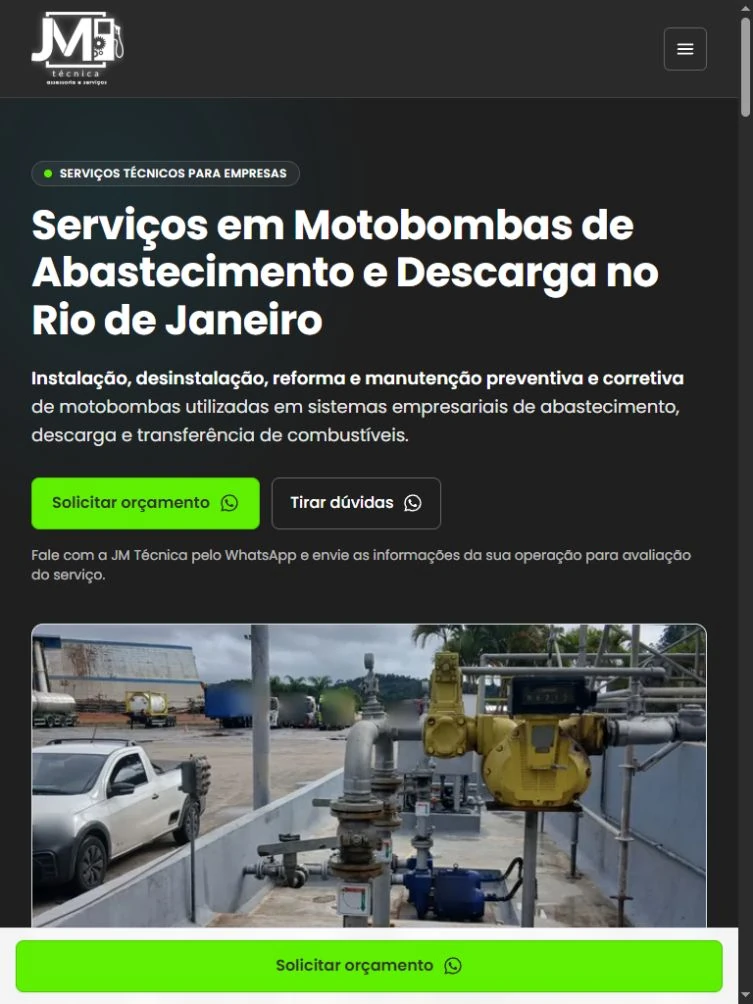
The warning-sign grid changes from three columns on desktop to two on tablet and one on mobile. The technical scope starts with four columns. Text and photos move into a vertical flow.
Navigation collapses into a menu, and WhatsApp remains accessible through a circular floating button on mobile as well.
Warning signs switch to two columns in tablet emulation. The content continues below the capture.
§ 03
AI-assisted development
I used ChatGPT/Codex and Lovable to develop the project, taking responsibility for content, interface design, and implementation. The page was hosted on Lovable.
- Content in a working page
- The page brings together section navigation, two galleries, an expandable FAQ, and quote-request links.
- Visual continuity
- I kept JM Técnica's visual language while giving this maintenance offer its own content structure and copy.
§ 04
SEO
The search focus is fuel dispenser and meter maintenance in Rio de Janeiro. I carried that focus into the title, description, and content, keeping the scope distinct from the fuel pump services landing page.
- Metadata and hierarchy
- The rendered page documented a canonical URL, language declaration, section headings, and structured data for the company, service, navigation, and FAQ.
- Service and location
- The copy describes business services. The footer distinguishes the headquarters in São Bernardo do Campo, São Paulo, from field service in Rio de Janeiro and São Paulo, subject to confirmation.
↳ The documentation records the implementation. No search, conversion, or loading-speed results were supplied.
§ 05
Delivery and feedback
The client liked the delivery, based on the feedback I received. I was not given contact counts, so the case study presents the page I built and that response, without claiming business results.
§ 06
Screens
Images from the version captured on October 22, 2026. Tablet and mobile views use viewport emulation.
Desktop · 03
Tablet · 03
Mobile · 03
§ 07
Credits
Matheus Barros: design, UX/UI, copywriting, SEO, and development. Caio: photo selection, copy review, and Google Ads campaigns.
The project carries a public development credit to Galática MKT.